Summary
Overall, the model performed strongly in both its point prediction accuracy (its average predicted vote shares) and probabilistic calibration (how trustworthy its probabilities were). The Mean Absolute Error (MAE) - the average a candidate's predicted vote share was 'off' by - was 2.384%, substantially lower than the 3–3.5% range typically seen when the model was tested on past elections. This suggests the model generalised well to the 2025 federal election. Further, the model's MAE materially outperformed that of YouGov's final MRP model .
The model’s win probabilities of favourites were also well calibrated. For example, among the 17 electorates where the model gave the favourite a 70–80% chance of winning, the favourite actually won in 76.5% (13/17) of cases, closely matching the predicted probabilities. The fact that these closely align with the actual results is good evidence that the model's predicted win probabilities are trustworthy.
The election demostrated its sense of humour in satisfying a pre-election example of mine. Of the five electorates used to demonstrate that an 80% favourite win probability implies that roughly one seat in five should be lost on average, exactly one did so. This was Hughes, which Labor won off the Liberals, despite this outcome being among the least anticipated of the five in pre-election media coverage.
The uncertainty ranges produced by the First Preference model were slightly narrower than ideal across the board. As an example, 48.6% of candidate's actual vote shares fell inside the model's 50% credible intervals, indicating slight overconfidence. Highly unexpected outcomes were treated less likely than they actually were: 36 of the 1126 candidates' vote shares were outside the model's 99% credible intervals, significantly larger than the 11-12 you would expect on average.
As with any election model, performance varied across candidates and parties. The model found it difficult to capture unassociated emerging independents, as well as shifts in support between the numerous minor right-wing parties. Among the larger parties, uncertainty was slightly overestimated for Labor, the Greens, One Nation, and the Trumpet of Patriots, while it was underestimated for the Coalition parties, likely reflecting the use of Coalition vote share as the reference category in the ALR transformation used to calculate vote shares. These limitations, and their implications, are discussed in more detail below.
Calibration
First thing's first - should you have trusted the model? The following calibration table shows how the win probabilities the model produced compared to the actual results. It splits the electorates into 'bins' based on the model's probability of the favourite winning, and compares the midpoint of those bins to the proportion of electorates where the model's favourite indeed won. If probabilities are well calibrated, the observed win proportion should be close to the midpoint of each predicted-probability bin.
| ‘Favourite’ win probability bins | <60% | 60–70% | 70–80% | 80–90% | 90–95% | 95–99% | 99%+ |
|---|---|---|---|---|---|---|---|
| Midpoint | 50.8% | 65% | 75% | 85% | 92.5% | 97.5% | 99.5% |
| Number of electorates | 11 | 13 | 17 | 22 | 26 | 34 | 27 |
| Number where favourite won | 4 | 8 | 13 | 18 | 24 | 34 | 27 |
| Observed win proportions | 36.3% | 61.5% | 76.5% | 81.8% | 92.3% | 100% | 100% |
Given the small sample sizes involved, it's quite lucky that the win proportions observed in the 2025 election match so closely to the expected midpoint of the bins. The only thing standing out is the <60% bin, where only 4/11 of the favourites won despite the average favourite win probability of the bin being 50.8%. While not too concerning due to the small sample size of 11 electorates, this is largely a product of the favourite in 9 of these electorates being the Coalition - meaning the movement of these seats was positively correlated - and the Coalition went on to lose the election in a landslide.
This highlights the issue of dependence in such a calibration analysis. Here, we need to assume 150 independent electorate winner outcomes. However, in reality there exists strong dependence, both positive and negative, between groups of electorates. A dependence-free measure of calibration would require an accurate measure of the correlation of electorates, but that is very tricky to reliably obtain.
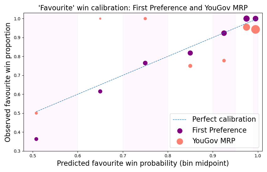
Comparing calibration against the final YouGov MRP poll model in the figure above highlights the reasonably healthy behaviour of the First Preference model. The dashed blue line represents perfect calibration. Observations above the line are underconfident - giving the favourite a smaller-than-observed probability of winning; those below the line are overconfident. The YouGov model suffered from systematic overconfidence: most of its predictions were very confident, however from the 70 electorates where the favourite rounded up to a 100% chance of winning, 4 of them lost! While fewer of YouGov's favourites lost (14 compared to 22), the First Preference model's probabilities proved to be substantially more trustworthy based on this calibration analysis.
Mean Absolute Error (MAE)
The model's overall MAE was 2.384%: if choosing a candidate at random, you would expect the model's prediction to be off by that amount. This is materially lower than the 3-3.5% seen when testing on the 2016, 2019, and 2022 elections. A reason may be that the model for the 2025 election had access to more data, being trained on all 3 of those years; the others were only trained on 2. It could, however, just be a product of a fairly well-behaved election!
The bar plot below shows the MAE among candidates in each of the parties with the top 10 vote shares, illustrating that MAE tends to grow with average vote share.
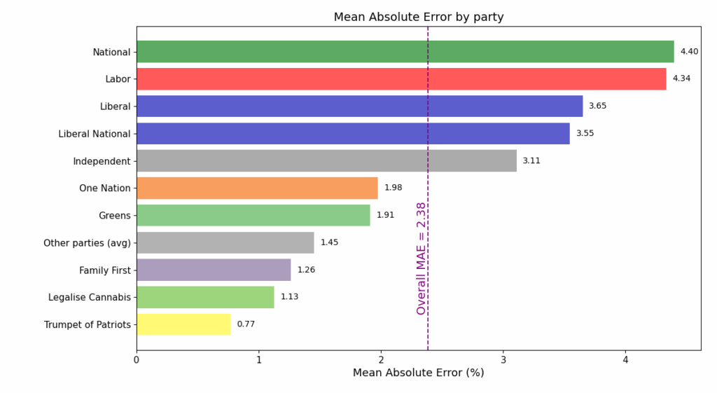
The challenge with MAE as a measure of error is that in varies in significance depending on the party's vote share. A 1% absolute error for a party that receives 2% of the vote is much more substantial than for a party receiving 40. This is why the highest MAEs observed are among the most established parties. In fact, the bar plot above almost reproduces the party ordering by their average vote share in the seats they contested.
On the other hand, the mean results of the smaller parties are less significant for inferring the overall election outcome, so much so that they are usually lumped into an 'Other' category in probabilistic forecasts. Hence, a large error in a small party's vote share is counterweighted by its insignificance in the grand scheme of things. The philosophy that this model takes is that these effects balance out, allowing MAE to act as a convenient measure.
Comparison with other models requires transforming vote shares predictions to the same sets of candidates. Since YouGov's MRP model only projected support for Labor, Coalition, Greens, Independents, One Nation and 'Other', vote shares of Coalition parties and smaller parties need to be aggregated to fit those categories. Under YouGov's party selection, the First Preference model has an MAE of 2.965%, outperforming YouGov's 3.303%.